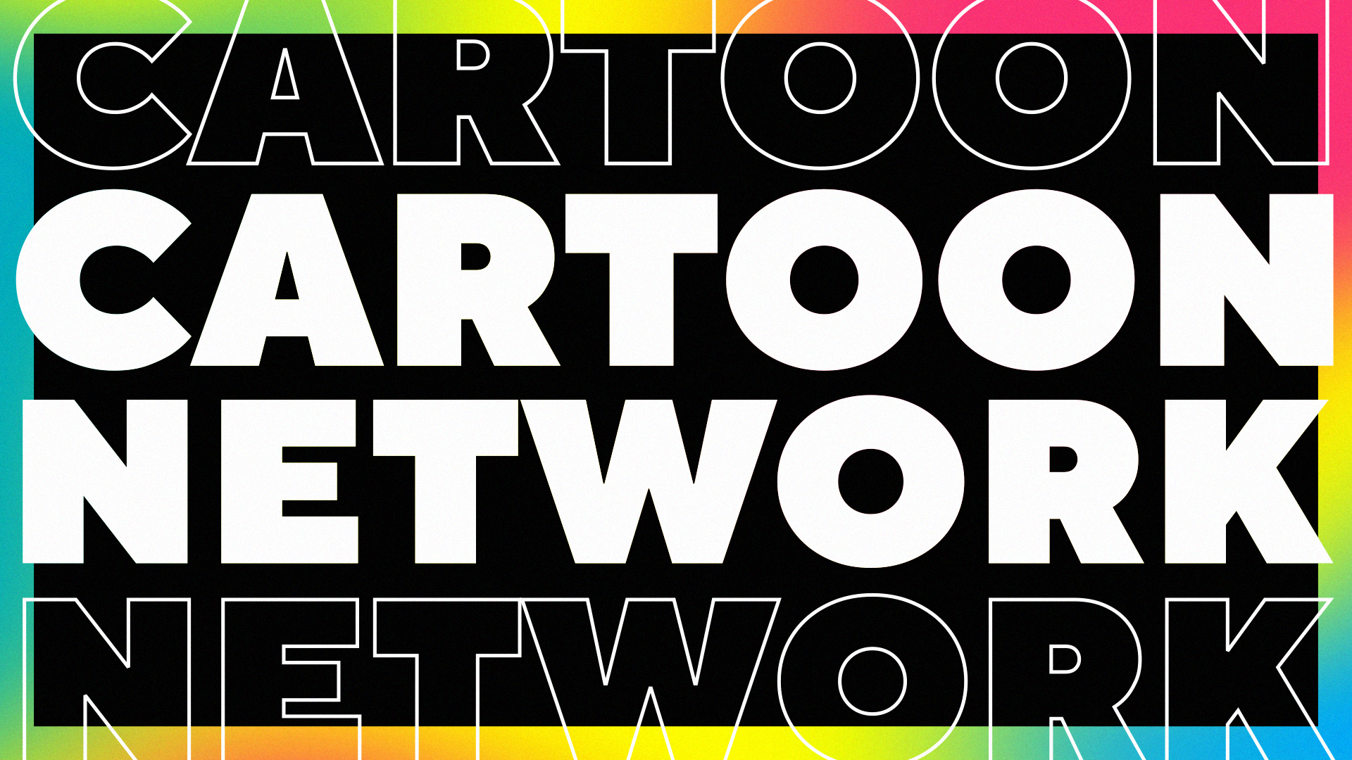
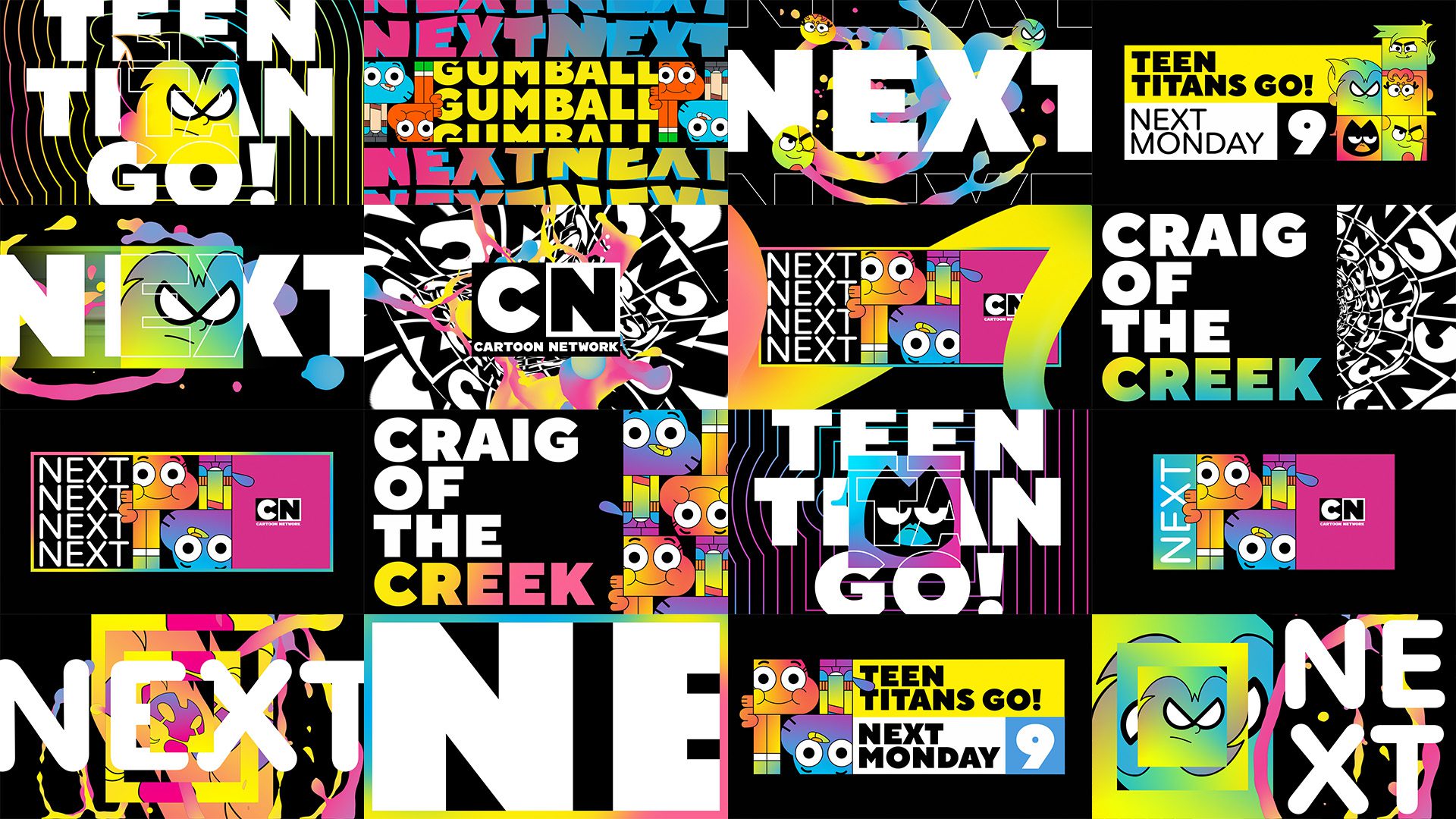
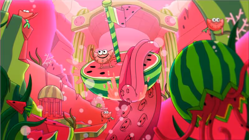
Cartoon Network
Redraw Your World

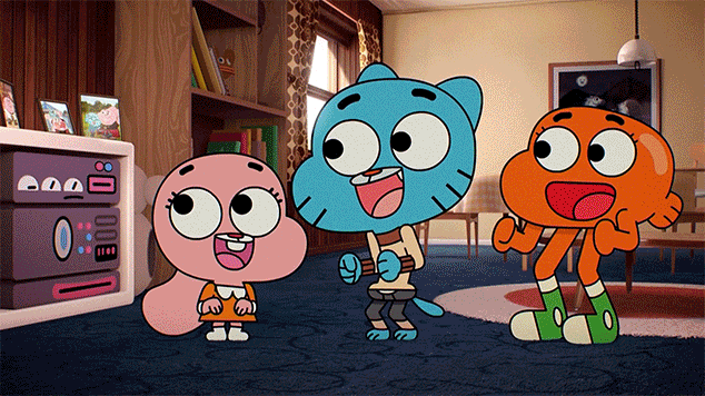
A bold typographic world that reimagines Cartoon Network with color and attitude
Client
Cartoon Network
Year
2022
Project Summary
For the Cartoon Network rebrand, we built a fresh identity packed with saturated color, expressive motion and a playful sense of chaos. The new system leans on energetic typography and a lively universe of shapes and movement that reflect the channel’s creative spirit. The result is a renewed visual language that feels loud, modern and unmistakably Cartoon Network.
The dream team behind the gimmick.
Credits

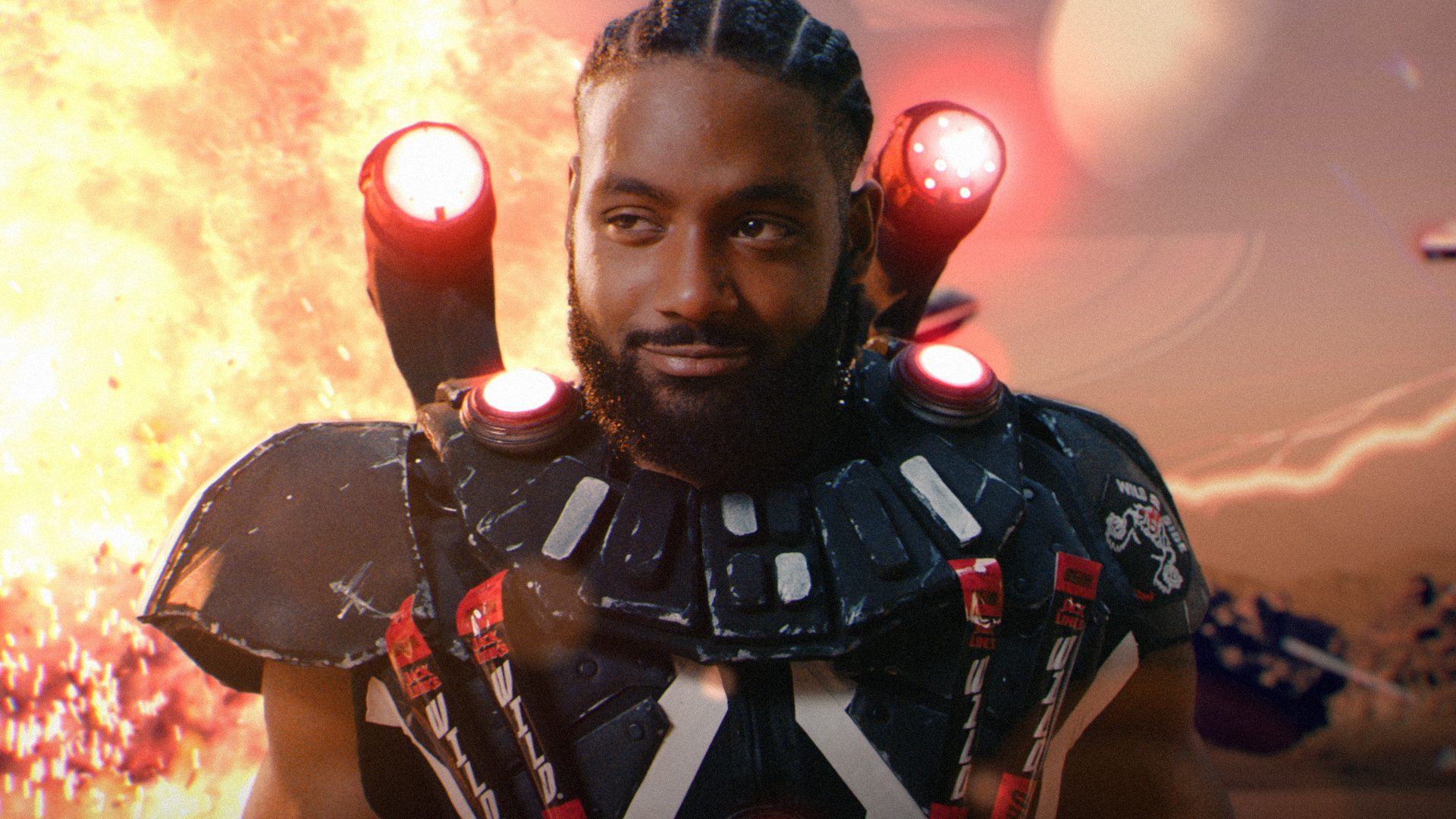
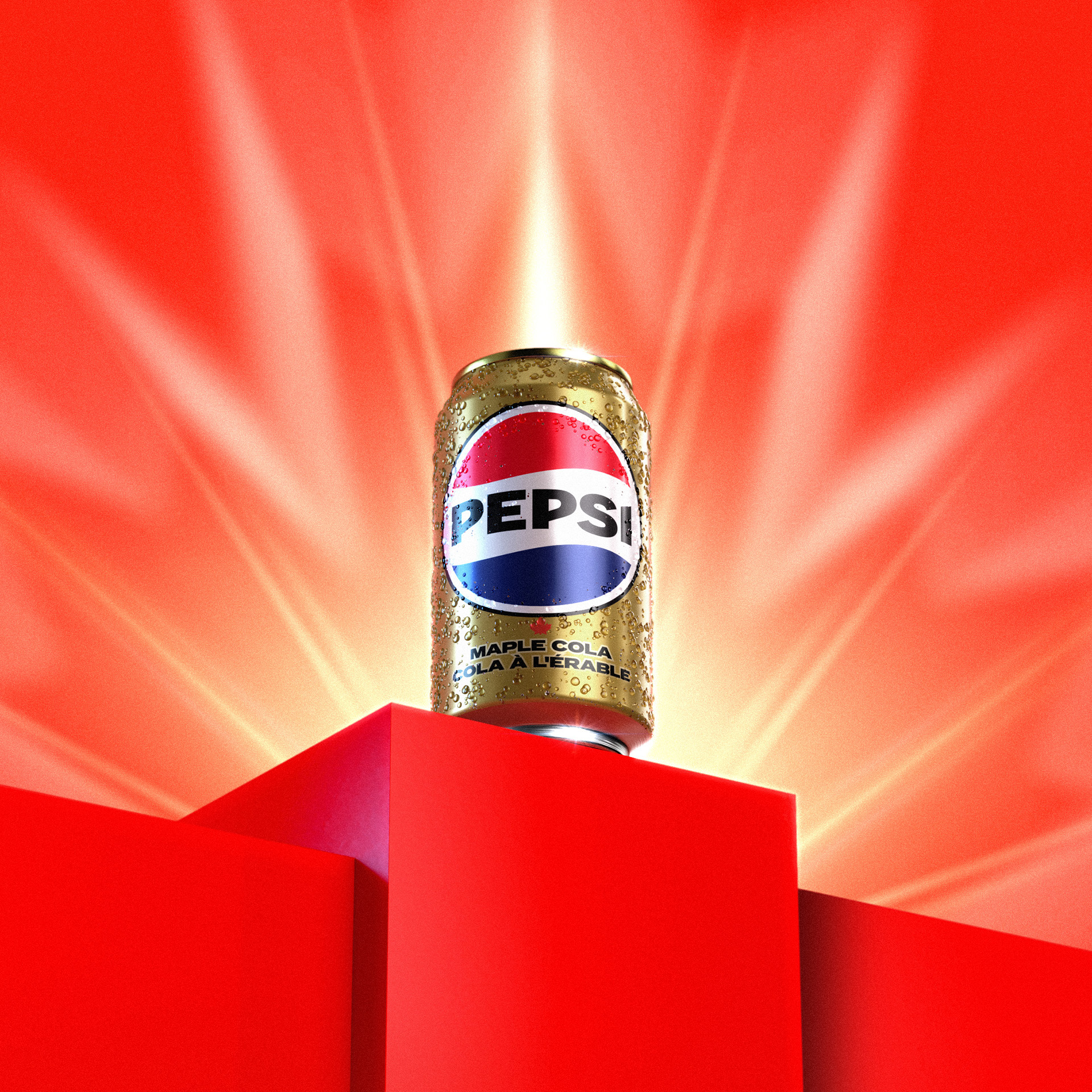
PEPSI SPECIAL EDITION
PEPSI
Youth Wellness
TikTok
Crunch into Chaos
Havoc
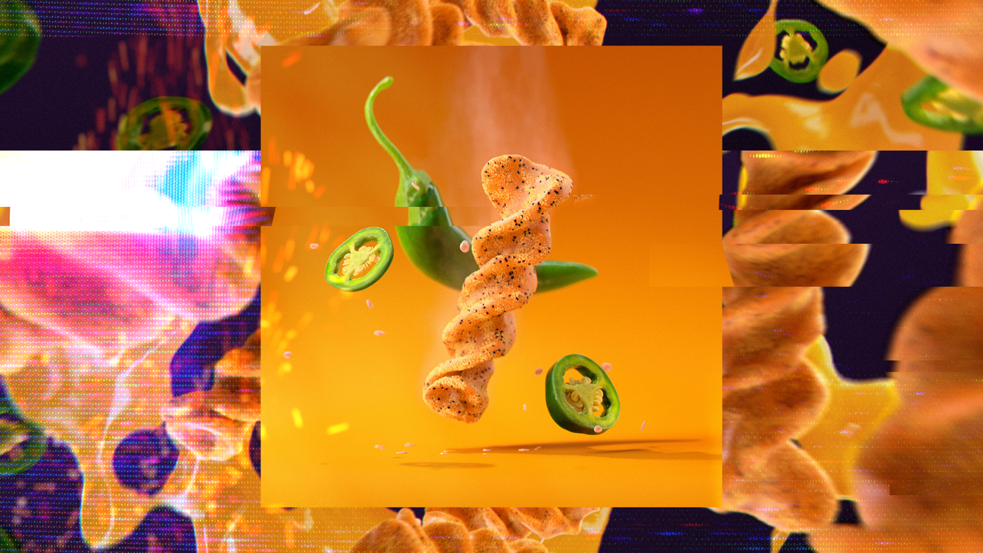
Unhinged Circus
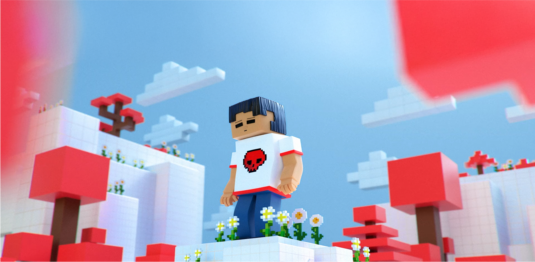
Jolly Ranchers
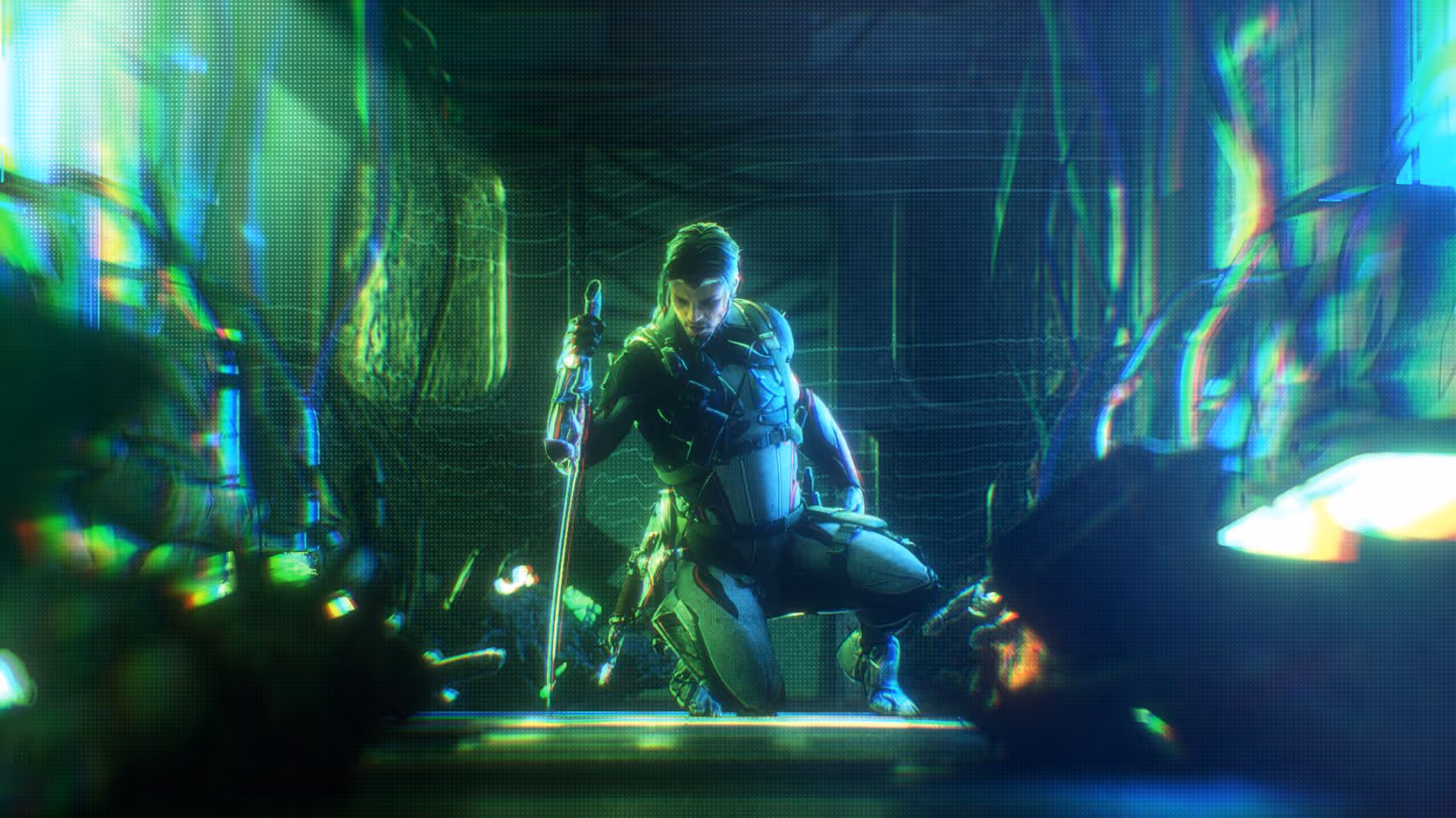
Tennocon
Tennocon
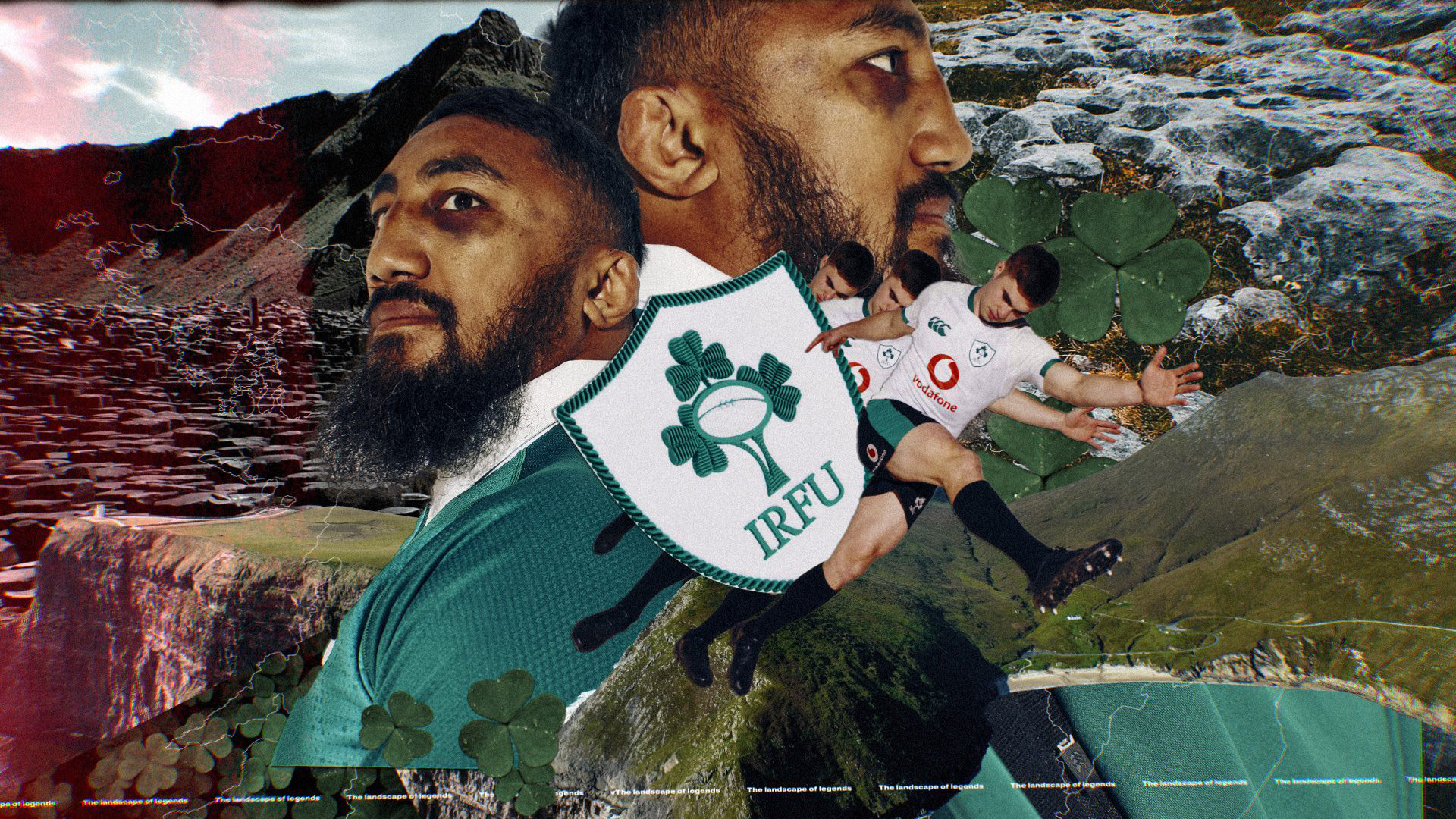
The Heart of Rugby
Cantebury
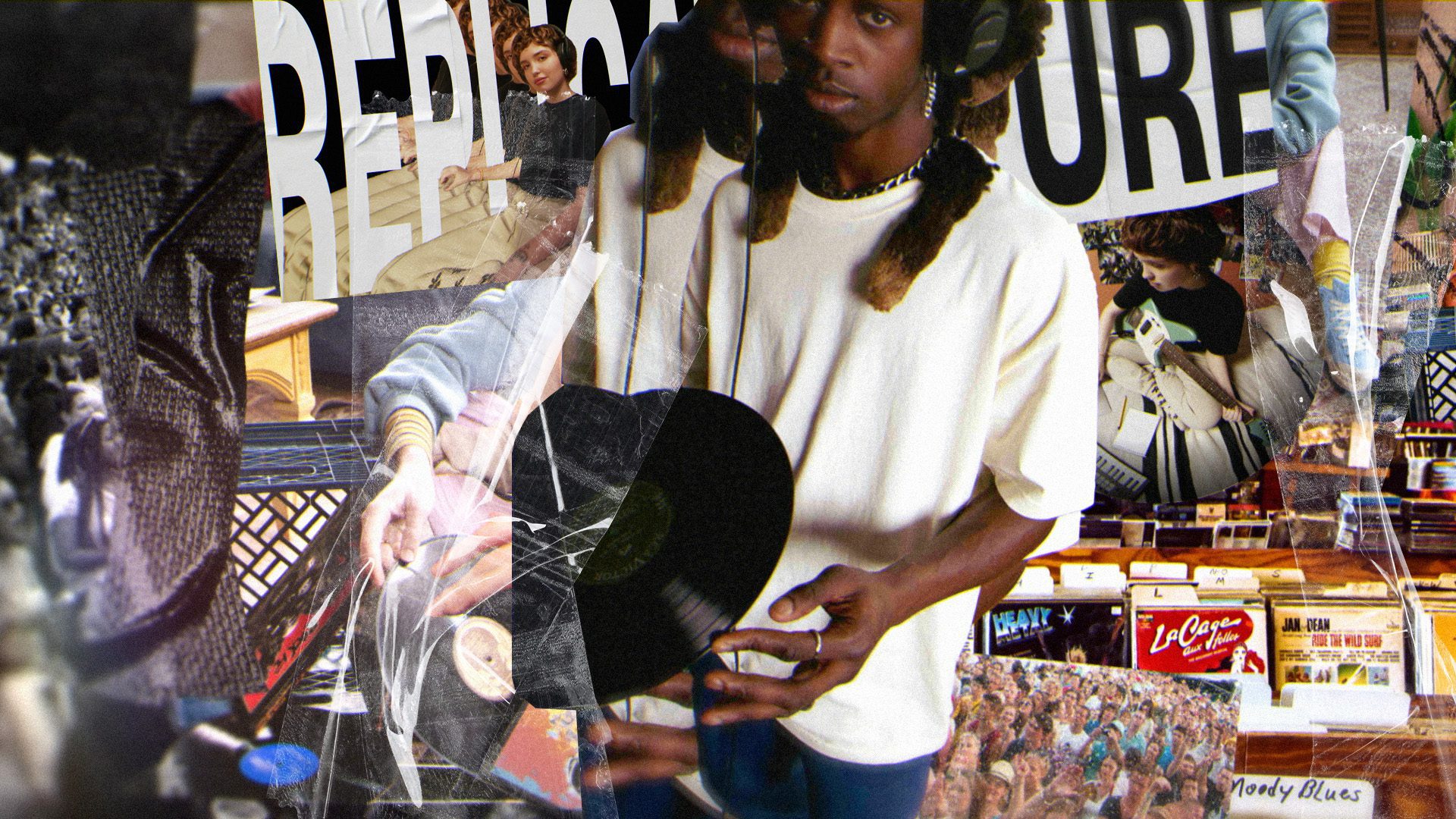
The Next Generation
American Apparel
No Small Dreams
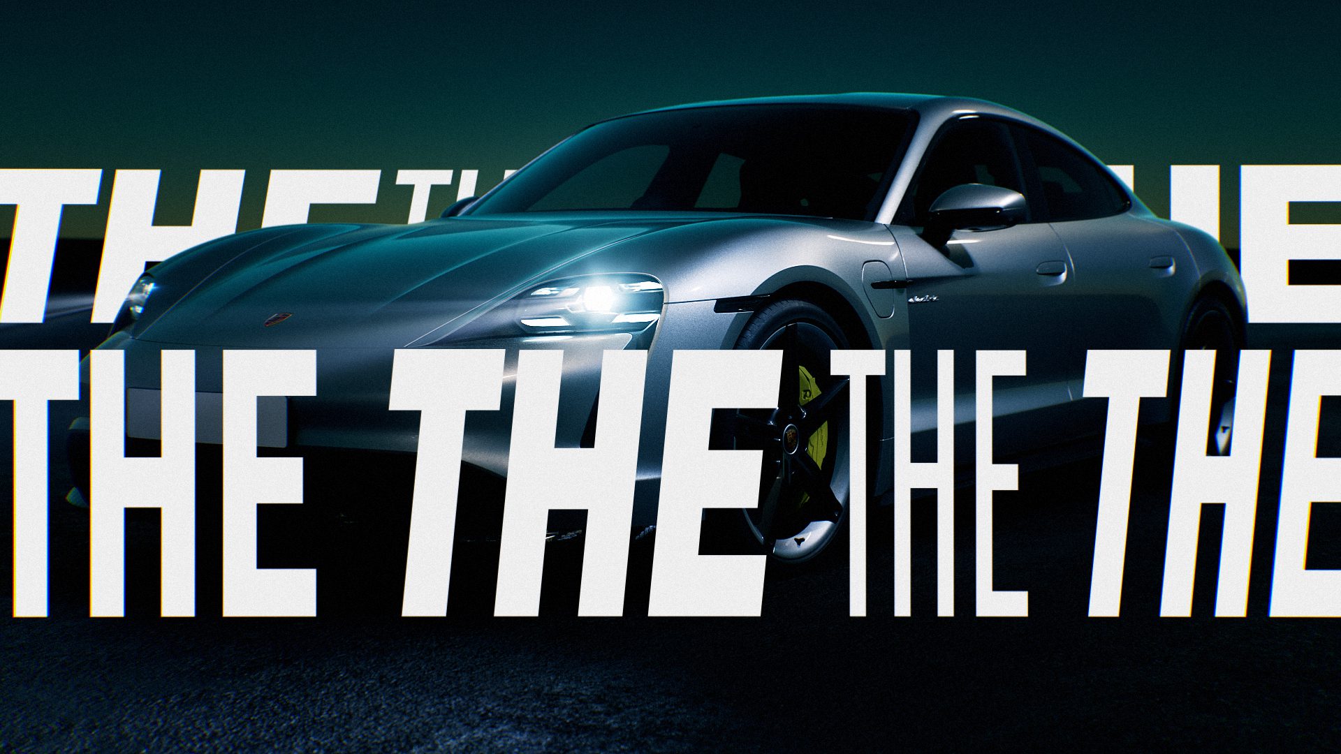
Porsche
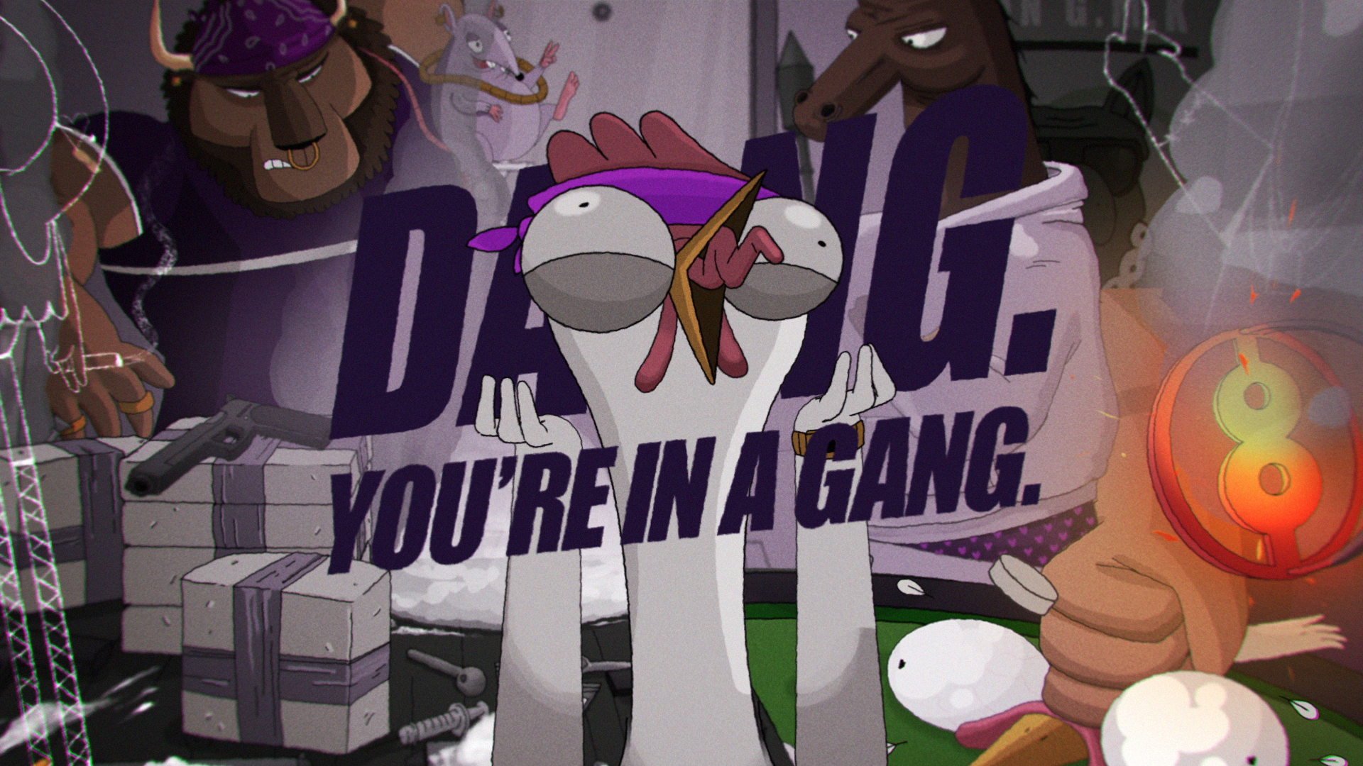
Dang, you're in a Gang
ALERT
Quick contact

Oops! Something went wrong while submitting the form.